 Credit: Pxhere
The main aim of any ecommerce website is, of course, to sell a product or service. So it’s no surprise that one of the most important pages on a website of this nature is the product details section.
In fact, around 47 percent of visitors will visit your products or services pages before anything else. Yet all too often, web designers make the same mistake on this critical page, hamstringing sales, and failing to convert.
This all-too-common blunder is to create product pages that fail to give sufficient information about the items they promote, or that fail to do so in a clear and comprehensible manner. Clarity is critical if you want people to stick around and make a purchase; they need to know exactly what they’re looking at, and why they should want to buy it.
Fortunately, while this mistake is a common one, it is also easy to avoid, and easy to remedy. Run through this checklist when composing your product details pages, and not only will you have boosted your sales potential, but you’ll also be one more step ahead of your competitors.
Recommended reading: 5 Tips For Helping Your Ecommerce Site Compete With The Big Boys
The Devil Is In The (Product) Details
A lot of the problem lies in failing to provide enough actual information about the product or service being sold. When a potential customer heads to your product details page, they’re hoping to learn more about your products, how they’re made, and what sets them apart.
However, if you’re familiar with the format of a typical WordPress ecommerce store, for example, you will already have seen how many of these websites provide no more than the item’s name and price. Many even fail to include a picture of the product.
A lot of this comes down to a lack of familiarity with basic web design. Aspiring entrepreneurs set up their stores, making the best they can of the tools available, and avoiding extensive modifications to store templates in case they impact functionality.
Unfortunately, while this may seem like the safe approach, it can severely damage your sales. Consider what your customers want to know about your product, and what you want to tell them.
- Create a list of these key points, and work them into a concise, but informative product description.
- Make sure your pricing structure is clear, or that there is a straightforward and obvious means of securing a quote.
- Provide details of factors such as the materials used, where they are sourced, and whether there are any available variants on the same product.
- If an item is out of stock, ensure this is clearly stated, and if possible provide details of when it may be available again.
It can be tough to answer all of your customers’ questions from the word go, but you can always add further information at a later date, or engage with customers directly to respond to their queries.
A Picture Speaks A Thousand Words
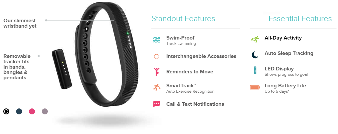
Another aspect of providing clear and engaging information about your products is to include high quality pictures of the products themselves. Choose an angle that gives a clear view of the product and its key features. Depending on the complexity of the item, or the novelty of its features, you could even follow FitBit‘s example, and add a few labels to the image.
 Credit: FitBit
Remember, it’s not just about how these images appear on your website, but the impression they give when they show up in searches, or are shared on social media. This means great photography is critical. Ensure that your subject is well-lit, and in focus, without any distracting elements in the background. Consider running your images through some post-processing software, such as Lightroom, to give them that extra sparkle.
Naturally, video content can also give your product page a boost. However, this should not come at the expense of the other elements we have mentioned. You want customers to understand what you are selling at a glance. That being said, including an explainer video that gives a little more insight into the product’s features, conception, or manufacture can all help to engage your site visitors and boost the chance of making a sale.
Shore Up That SEO
Since you’ll be writing some carefully-worded copy to really convey your brand’s message, and provide a clear picture of what you’re selling, this is a great opportunity to up your ecommerce SEO game. After all, where better to target your niche keywords and key-phrases than on the page that promotes your niche?
Be careful not to over-stuff your page with keywords, or it will seem clunky, unprofessional, and potentially untrustworthy. Instead, use your target words and phrases where they feel natural. Work them into headings where possible, and only link to relevant, related material.
Not only will this make it easier for visitors to navigate your website, but it will also help to raise your authority with search engine crawlers, making it more likely that people will find your website in the future.
SEO tactics even encompass your page URLs, so make sure your website uses a consistent and intuitive format throughout. This is one of the areas where underpinning your store with a flexible ecommerce CMS can be particularly helpful. Many of these systems enable you to set a desired format for your URLs, and will automatically generate consistent, meaningful addresses for each of your web pages.
Keep It Clean and Simple
There may be dozens of things you want to say about your product, or features you want to showcase. However, as with most aspects of web design, less is more. While it is important to provide detailed information about your product, this information also needs to be concise and easy to digest.
The same applies to your use of images and video. While you may decide to include more than one photograph of a product, make sure that there is a clear main image, in a prominent position.
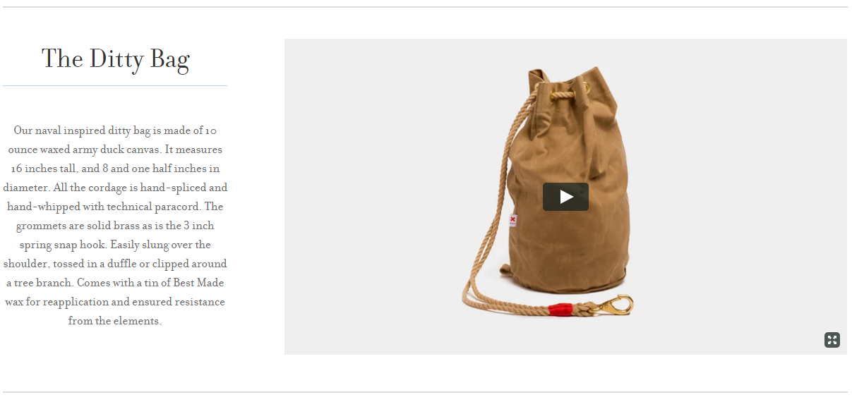
Avoid cluttering the page with extra elements, or too many pictures. The more visually confusing the page is, the less likely your customers are to stick around and sift through it. Take a look at this example from Best Made. They have a clean, minimalist aesthetic, including a clear item name, visual content, and some killer copy to back it all up.

Credit: Best Made Co.
It is worth remembering that cookie-cutter design choices, and a lack of clarity are damaging on any form of website. These errors are more prevalent on platforms such as WordPress, where it is all too tempting to simply pick a template, and change the bare minimum. However, great branding is all about standing out from the crowd. If your website looks generic, then visitors will expect your product to be generic as well.
So whether you are working with WordPress, or using an ecommerce CMS, take the time to streamline your aesthetic. Refine your brand’s voice, polish your SEO strategy, and of course, create some high quality product pages that inform, inspire, and ultimately sell.
 Victoria Greene is a branding consultant and freelance writer. On her blog, VictoriaEcommerce, she covers a range of topics in the world of ecommerce, offering tips on how brands can make the most of the content that they have on the website for their online business.
